1. Introduction
SNOW.fyi provides 14-day weather forecasts tailored for global ski resorts. The platform focuses on data critical to skiers and snowboarders, including snowfall, freezing levels, wind speeds, and rain indicators. This allows users to identify optimal conditions and avoid unfavorable weather.
SNOW.fyi is a passion project dedicated to the snow sports community. It is entirely free to use, featuring no subscriptions or advertisements, ensuring uninterrupted access to high-quality data.
2. Quick Start Guide
2.1 Card Design Overview
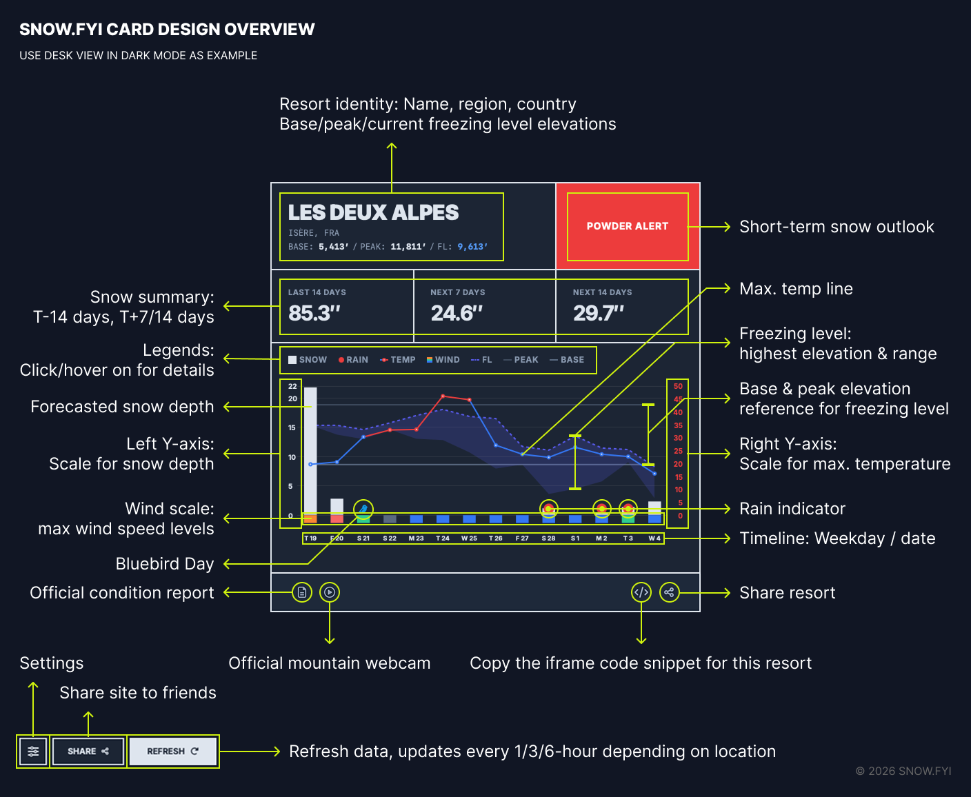
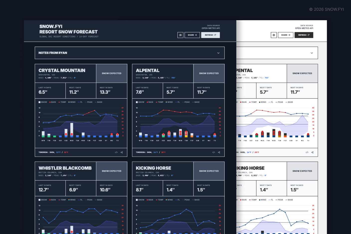
The forecast card contains comprehensive meteorological data. Below is a guide to navigating its visual elements.
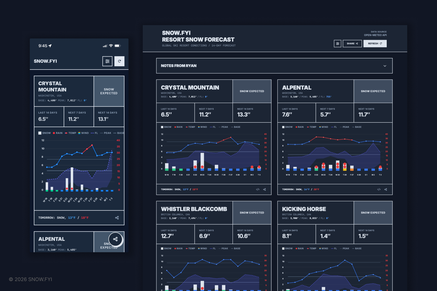
Mobile vs. Desktop Layouts: The card interface adapts to your device. On desktop, users can access features like the iFrame copy function to embed cards on external sites (detailed in Section 3.9).
Light/Dark Mode: The interface automatically syncs with your device’s system-wide light or dark mode settings.
2.2 Manage Resort Cards
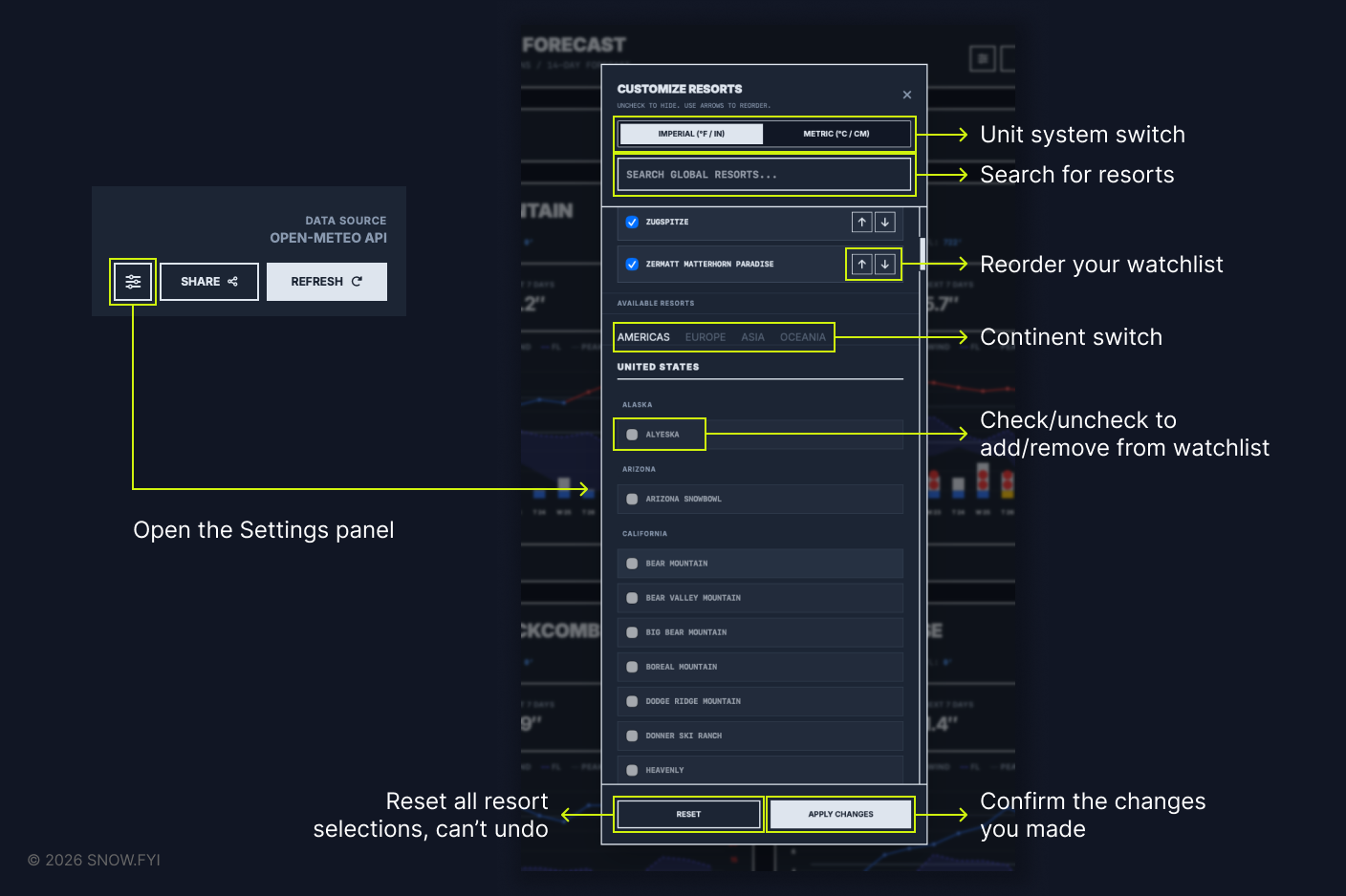
Settings Panel: Use the Settings Panel to add or remove resorts. You can reorder your watchlist using the up/down directional buttons.
Unit Switching: Tap your preferred unit system within the settings to toggle between metric and imperial measurements.
Apply Changes: Ensure you click “Apply Changes” to save your configuration.
2.3 Chart Legend
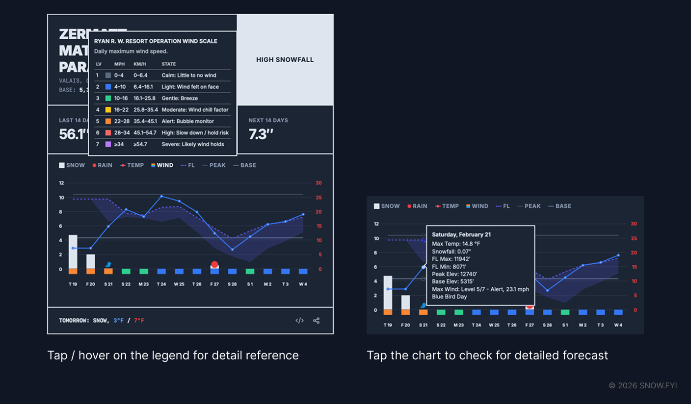
Chart Legend: For a detailed explanation of any metric, tap (mobile) or hover over (desktop) the legend items.
2.4 Share to Friends
- Mobile: Tap the share button (lower right) to open your device’s native share sheet.
- Desktop: Click the share button to copy the resort title and URL to your clipboard. You can then paste (Cmd+V on macOS / Ctrl+V on Windows) the link into chats or documents.
3. Core Features
3.1 Snow Summary
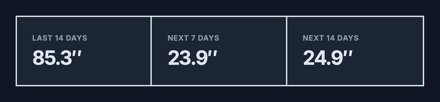
The summary row consists of three distinct data cells:
- Last 14 Days (0-Hour Forecast): This displays the “0-hour analysis”—a data-assimilated simulation derived from the most accurate weather models available. Note: This is a simulation, not a direct observation. While it is the best available proxy for estimating past snowfall, biases may exist. For resorts that are applicable, click the “Official Condition Report” button to view data reported directly by the resort.
- Next 7 Days: The cumulative forecasted snow depth for the upcoming week.
- Next 14 Days: The cumulative forecasted snow depth for the upcoming two weeks.
3.2 Snow Forecast Bar Chart
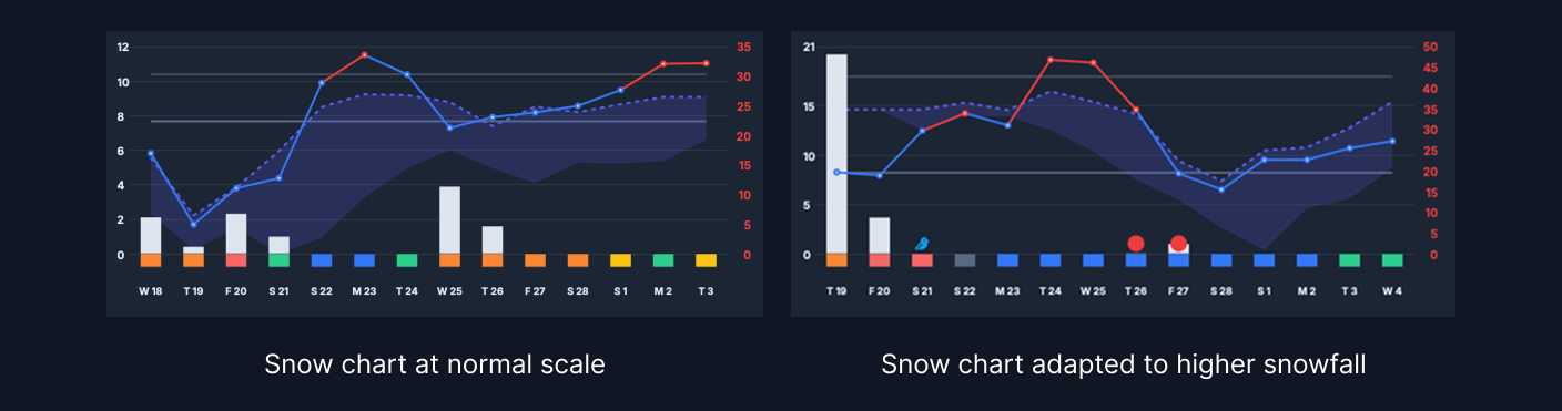
Future snowfall is visualized as vertical bars. The height of each bar represents the daily forecasted accumulation (scale on the left Y-axis). The default chart maximum is 12 inches (30 cm); if a forecast exceeds this, the axis scales dynamically.
Data Update Frequency:
- North America & Europe: Every hour (Short-term forecasts update every 3–6 hours).
- Japan: Every 3 hours.
- Asia (Others): Every 6 hours.
- South America & Oceania: Every 6 hours.
Note: Due to processing latency, actual update times may vary slightly. As the forecast engine is in active development, please report significant discrepancies between the report and actual conditions.
3.3 Freezing Level
This metric tracks the elevation boundary separating rain from snow (and where snow begins to melt). The freezing level fluctuates daily, typically bottoming out at dawn and rising throughout the day.
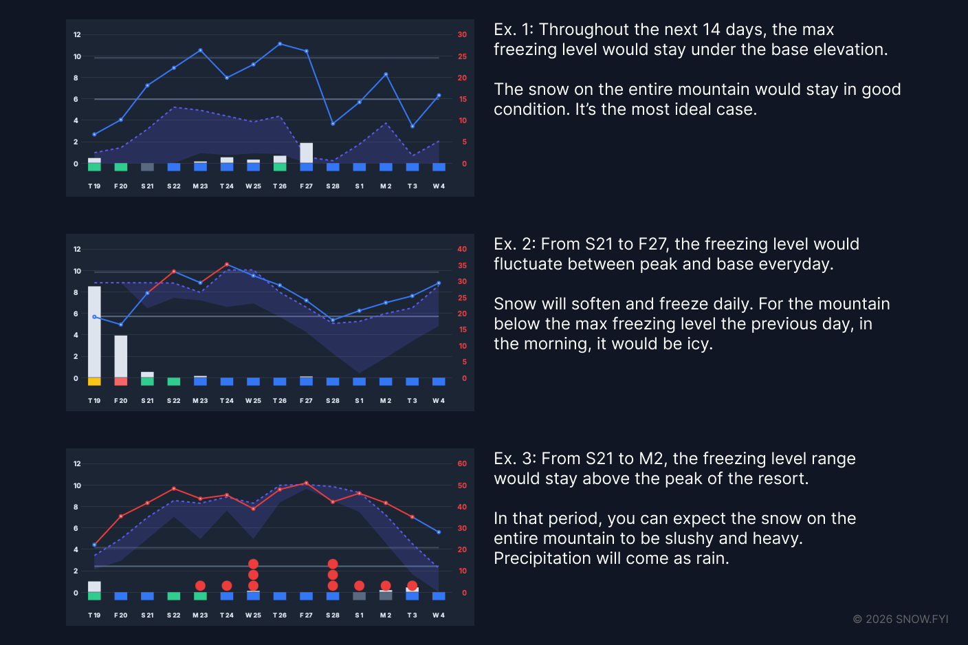
Interpreting the Chart:
- Purple Dashed Line: Represents the daily maximum freezing level elevation.
- Purple Shaded Area: Represents the range of fluctuation for the day. A wider band indicates high variance; a narrow band indicates stable temperatures.
- Elevation Context: Compare the purple band against the resort’s Base and Peak lines:
- Below Base: Dry snow across the mountain.
- Between Base & Peak: Variable conditions; softer snow likely at lower elevations.
- Above Peak: Conditions are likely wet and heavy.
Note: While temperature inversions occur (warmer mid-mountain than base), the current chart visualization does not depict this specific anomaly.
3.4 Wind Scale
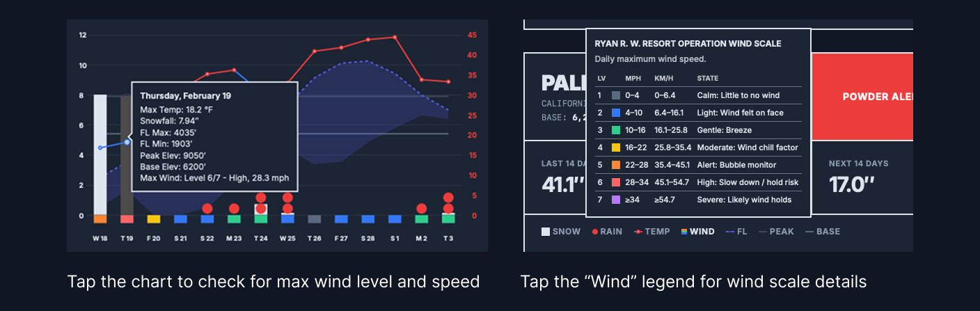
The row of colored rectangles under the X-axis indicates maximum daily wind speeds.
The Ryan R. W. Resort Operation Wind Scale System
Standard Beaufort scales are not centered around skiers. So I created a custom scale designed specifically for resort operations, focusing on lift safety and visibility.
On Jan 10th, 2026, SNOW.fyi successfully forecasted chairs could be held at Crystal Mountain.
- Usage: Avoid planning trips on Level 6 or Level 7 days.
- Timing: The rating reflects the maximum wind speed for the day. If high winds occur outside operating hours, lift status may not be affected.
|
Level |
Range (mph) |
Range (km/h) |
Operational State |
|---|---|---|---|
|
1 |
0–4 |
0–6.4 |
Calm: Little to no wind |
|
2 |
4–10 |
6.4–16.1 |
Light: Wind felt on face |
|
3 |
10–16 |
16.1–25.8 |
Gentle: Breeze |
|
4 |
16–22 |
25.8–35.4 |
Moderate: Wind chill factor |
|
5 |
22–28 |
35.4–45.1 |
Alert: Bubble chair monitor |
|
6 |
28–34 |
45.1–54.7 |
High: Slow down / hold risk |
|
7 |
≥34 |
≥54.7 |
Severe: Likely wind holds |
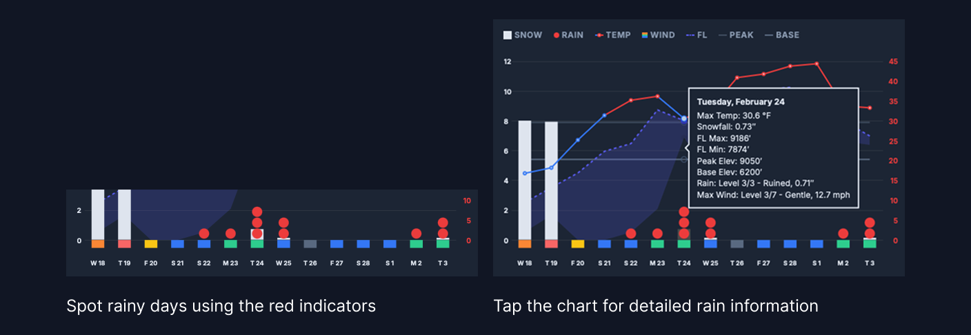
3.5 Rain Indicator
Rain degrades snow quality and can destroy the base. SNOW.fyi uses a “Red Dot” system (appearing near the X-axis) to flag rain events.
- Level 1 (1 dot): Damp (<0.1” / <2.5mm)
- Level 2 (2 dots): Wet (0.1”–0.5” / 2.5–12.7mm)
- Level 3 (3 dots): Ruined (>0.5” / >12.7mm)
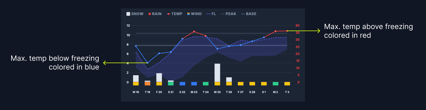
3.6 Max. Temperature
The line chart with circular nodes tracks the daily maximum temperature (scale on the right Y-axis).
- Blue Nodes: Max temperature is below freezing (32ºF / 0ºC).
- Red Nodes: Max temperature is above freezing.
Tip: Snow melt occurs on “Red Node” days. If the temperature or freezing level drops the following day, surfaces may become icy.
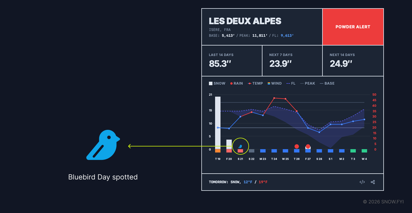
3.7 Bluebird Day Spotter
SNOW.fyi identifies “Bluebird Days”—ideal conditions defined as low cloud coverage immediately following fresh snowfall—a first in the snow forecast industry. A small bluebird icon appears near the X-axis when these conditions are predicted.
3.8 Dump Board
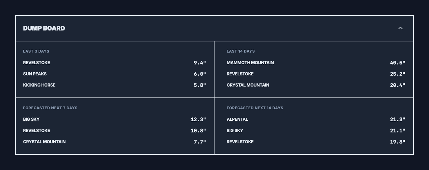
Many skiers and snowboarders compare the recent and forecasted snowfall to decide on their vacation destinations. Dump Board simplifies this process by analyzing the last 3/14 days and the next 7/14 days’ snowfall of the resorts on your watchlist and ranking them separately.
If your watchlist exceeds three, only the top three resorts will enter for the leaderboard.
3.9 Web app on Home Screen
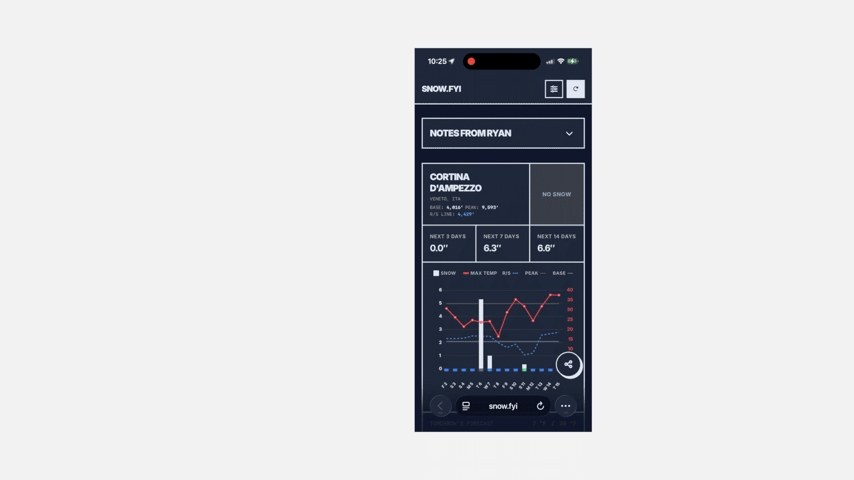
SNOW.fyi is optimized as a Progressive Web App (PWA). On mobile devices, you can “Add to Home Screen” to install it like a native app. This removes browser distincts (like the address bar) and maximizes screen space for data.
3.10 Official Condition Report and Webcam
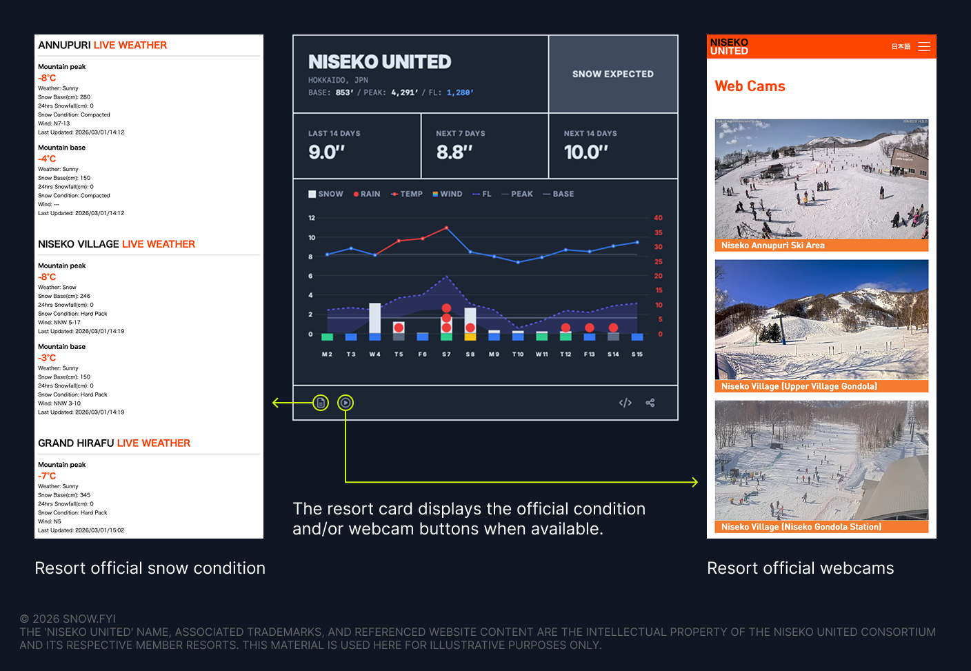
Base depth has been one of the most requested features by SNOW.fyi users. Due to technical, legal, and cost constraints, SNOW.fyi does not provide base depth data directly.
To help bridge the gap, if a resort publishes snow conditions on its official website, a link to that page is now available on the resort card.
If the resort also provides an official webcam for visually checking current conditions and crowd levels, that link is included as well.
Please note that collecting and maintaining official condition and webcam links for 700+ resorts is challenging, and resorts may update their URLs at any time. If you notice a missing link or an incorrect destination, please use the Give Feedback link at the bottom of SNOW.fyi to report it.
3.11 Iframe Embedding
You can embed resort cards into your own dashboards or websites.
- How to use: On the Desktop view, click the iframe copy button to grab the code snippet. Paste this into any HTML page.
- Functionality: The embed retains your selected unit system and resort.
- Limitations: iframe views currently display only a 10-day period.
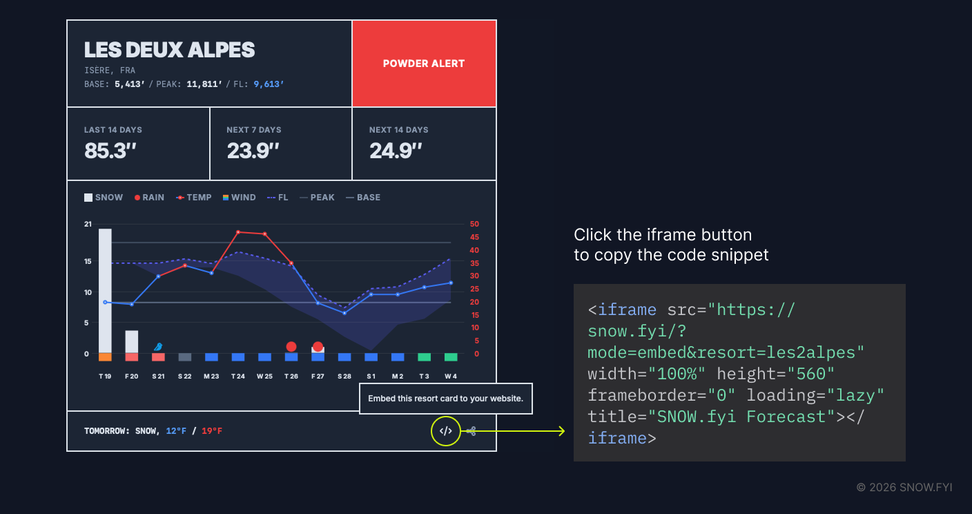
Example of an embedded SNOW.fyi card:
4. Glossary
- Base & Peak: On SNOW.fyi, Base refers to the lowest elevation served by the lift system, not necessarily the resort’s lodge or parking area. Peak refers to the highest lift-served point, excluding hike-to terrain.
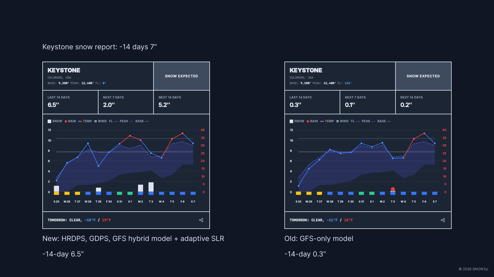
- Weather Model: Computer simulations that use physics and mathematics to predict atmospheric interactions over time. SNOW.fyi utilizes a specific mix of models (Global and Mesoscale) optimized for different geographic regions to account for complex mountain topography.
- Snow-to-Liquid Ratio (SLR): The volume of snow produced by one inch of water. While the standard baseline is 10:1, SNOW.fyi adjusts this based on temperature and humidity.
- Bluebird Day: A sunny, cloudless day immediately following a night of snowfall.
- Inversion: An atmospheric anomaly where warm air traps cold air in valleys. This results in warmer temperatures at the peak and freezing fog or clouds at the base.
5. FAQ
What weather models do you use?
SNOW.fyi employs a hybrid approach tailored to specific regions:
- North America: HRDPS, RDPS, HRRR, NBM, GEM Global, GFS Global.
- South America: GEM Global, GFS Global.
- Europe: DWD ICON-D2, Météo-France AROME, MeteoSwiss ICON-CH, ECMWF IFS HRES, GFS.
- Asia: JMA MSM, JMA GSM, KMA, CMA GFS GRAPES, ECMWF IFS HRES, GFS.
- Oceania: ACCESS-G, ECMWF IFS HRES, GFS.
Feedback on forecast accuracy for your specific region is welcome as the algorithm evolves.
Where on the mountain are forecasts based?
Forecasts are generated for mid-to-upper mountain elevations.
Does the Freezing Level chart show inversions?
Not currently. The chart compresses daily dynamics into a single dimension, making inversion visualization difficult.
Why is there no Base Depth or SNOTEL data?
- Base Depth: There is no reliable, standardized API for base depths, and many resorts do not report it. To maintain consistency, this data is omitted. Users could refer to the “Last 14 Days” tally as a proxy estimate. After the update on March 1, 2026, you can use the official condition page link on your applicable resort card to check the base depth.
- SNOTEL: Restricted to the Western US, SNOTEL station locations and operations vary enough that integrating them could introduce confusion rather than clarity.
Why use a red round shape for rain instead of a blue drop?
Blue drop icon is the natural and intuitive choice for general purpose weather forecast apps. However, since rain is such a bad thing for skiers and snowboarders, I chose to use a bold, primitive shape in red to represent rain. And there’s a pun: “NO TURN ON RED”.
Why is SNOW.fyi free?
This project began as a solution to a personal frustration with finding clean, free weather data. It remains free to save the snow community time and provide high-quality data without commercial barriers.
6. Support and Feedback
- Missing Mountain: If a resort is missing, use the reporting link in the search interface. All requests are added to the database regardless of resort size.
- Data Accuracy: If you observe forecasts deviating by >20% from other reliable sources, please use the Feedback link at the bottom of the page. This input is vital for calibrating data processing methods.